Design
Bridlewise’s cockpit is not a chat window with panels around it. It is an instrument panel for a recorded run. The visual system is called instrument glass over a paper logbook: cool carbon grounds, engraved micro-labels, a single electron-beam hue for what is actually live, and a light theme that behaves like paper rather than an inverted dark theme.
This page describes the intended system and the tokens that own it. It is a design document, not a certification that every surface has passed every check. The cockpit’s own tests and the design records in the testing repository are the evidence.
Three principles
1. The spine is the run. The conversation is the product’s center only because it is the visible edge of a run. The FLOW is full-bleed while active; the SWEEP is always present; the DESK is where acting happens. Everything else is instrumentation around the living run. The layout is computed from the run’s causal structure, not arranged by the user.
2. Action first. A fact earns default pixels if it carries an operable verb, is in an abnormal state, or was asked for. A control without a wired action is a bug, not decoration. Numbers are handles: a value opens its record and its setting. There is no dashboard of facts you cannot act on.
3. Synthesis, stated. Raw facts are the floor. Surfaces earn their place by deriving aggregate, match, comparison, or projection — and the derivation is visible one level down. A computed finding may not merely restate a single source. It says what it joined and what it concluded.
Two supporting laws run through all three:
- Honest data. Nothing fabricated. Absence renders as absence, in plain words. Every number is measured, with its time. A chart may not render with fewer than two real points.
- One fact, one home. A fact appears in one place at a time. Pinned monitors are references to the source, not duplicates. This is how the cockpit avoids tile sprawl.
The shell
┌────────────────────────────────────────────────────────────┐
│ HORIZON   40px   identity · place · annunciators · monitors │
├────────────────────────────────────────────────────────────┤
│                                                            │
│ FLOW      flex   the run — full-bleed beats                │
│                  prose at measure (76ch)                   │
│                  tools, diffs, findings at full width      │
│                                                            │
├────────────────────────────────────────────────────────────┤
│ SWEEP     48px   the ledger as a flight-recorder band      │
├────────────────────────────────────────────────────────────┤
│ DESK      64px   composer · gauges · breaker grip          │
└────────────────────────────────────────────────────────────┘
ROOMS   full-screen, summoned, one at a time, Esc closes
SCOPE   inspector sheet; side-docks on wide screens
HORIZON is the only top chrome: identity and place on the left, at most three annunciators in the center, at most four pinned monitors and the LENS toggle on the right. No metrics strip, no model selector parked here, no logout button. FLOW is the causal stream: typed beats, visible verbs, prose at a readable measure, instruments across the width. SWEEP is the recording lattice made permanent: a horizontal density band of the whole ledger for the current scope, with a now edge and scrub. DESK is where you act: one composer with three grammars, context gauges, and the breaker panel. ROOMS replace tabs and routes: Switch, Custody, Instruments, Settings, Memory, Tools, Editor. One room at a time; the flow stays alive underneath. SCOPE opens any fact in place.
The dense keyboard grammar is part of the design, not an afterthought: / or ⌘K for the command grammar, ⌘J for the Switch, ⌘. for the desk, ⌘' for Instruments, ⌘, for Settings, ⌘G for Custody, [ and ] to scrub, Enter to open a beat, Esc to return, . for a fact’s verbs, , for its setting, ⌘L for LENS. Every action must have a keyboard path.
Carbon and logbook
The default ground is carbon. The light theme is a real logbook: warmer paper, darker ink, the same semantic roles re-derived rather than inverted by machine.
| Role | Dark token | Value | Use |
|---|---|---|---|
| App ground | --ground-0 |
#101216 |
The page |
| Flow ground | --ground-1 |
#15181d |
Bleed rows, sweep housing |
| Beat surface | --ground-2 |
#1b1f25 |
Beats, cells, desk |
| Raised surface | --ground-3 |
#232830 |
Sheets, menus |
| Hairline | --line-1 |
#262b33 |
Borders |
| Structural rule | --line-2 |
#39404b |
Bezels |
| Primary ink | --ink-1 |
#e8ebef |
Body, values |
| Secondary ink | --ink-2 |
#a6adb8 |
Explanation |
| Quiet ink | --ink-3 |
#79818d |
Labels, metadata |
| The live beam | --beam |
#8fd3ff |
Streaming caret, bead, sweep head, causal ribbons, live chips |
| Confirmed | --ok |
#5fc78e |
Success, included |
| Attention | --warn |
#d9a84e |
Refusal, deferred, muted |
| Failure | --alarm |
#e26a5f |
Errors, destructive arming |
The beam is rare on purpose. It is spent only on what is genuinely live or selected: the streaming caret, the bead traversing a recorded edge, the sweep’s now edge, causal ribbons, the registration caret, live chips. There is no generic “info blue”. Category hues — turn, tool, effect, check, finding, steering, anomaly, healing — appear in sweep bins, beat glyphs, and scope headers, not as chrome. Each has a matching --on-* ink for contrast. Errors use the alarm hue, never a category hue.
Semantic shape and text accompany color. A refusal is a decision, not a malfunction: it wears --warn, not --alarm. A failed operation wears --alarm. A disabled control is recessed with --layer-disabled, not made into faint text.
Type
IBM Plex Sans for labels, prose, and explanation; IBM Plex Mono for values, code, and numbers where alignment matters. The stacks lead with the Plex faces when locally installed and fall back to a system stack chosen for tabular figures. No CDN is used. Self-hosting the Latin-subset WOFF2 files is an open task; until they are vendored, the fallback is intentional.
| Step | Token | Size / treatment |
|---|---|---|
| Display | --f-display-size |
clamp(30px, 4vw, 44px), tight tracking |
| Editable term | --f-edit-size |
1.75rem |
| Instrument value | --f-value-size |
22px, mono, weight 620 |
| Prose | --f-prose-size |
1rem, line-height 1.6 |
| UI | --f-ui-size |
0.9375rem |
| Data | --f-data-size |
0.875rem, mono |
| Micro-label | --f-micro-size |
0.8125rem, weight 560, engraved |
| Nano note | --f-nano-size |
0.75rem |
Sentence case, concise copy, familiar words. Preserve recorded and user text exactly. Essential metadata must remain legible; it may not rely on faint ink. The docs site uses a subset of this scale for long-form reading, with the same faces and palette roles.
Shape and space
- Hairlines, not shadows. Bezels are one-pixel lines. Raised surfaces are a luminance step, not a drop shadow.
- Open lower edge, restrained raised corner. Controls and fields share a recipe; a primary action can join a field as a flush terminal face. Related controls share rhythm without pretending an icon, switch, and numeric input are identical.
- One target floor. Interactive controls get at least 40 CSS pixels in both axes, rising to 44 for coarse input. Padding counts; visible ink may stay quiet. Inline exceptions exist only for secondary paths constrained by a dense baseline row; the primary act always has a larger target or a keyboard chord.
- No nested cards. A box containing an input box containing an action card is the failure mode. An editable fact opens in place: its name, scope, and explanation appear once; value and commit share one surface; the confirmed value and result sit directly below.
States and honesty
The cockpit’s answer axis is explicit: pending, absent, refused, failed. A read that succeeded with nothing to show says “not measured yet” or “no runs in this window”; it does not render a zero that looks like a measurement. A control can be at rest, hovered, focused, armed, working, succeeded, refused, or absent. Rest is the default and has no state token; the others are departures with visible treatments.
Motion is finite and event-bound. A confirmed change may receive one brief arrival treatment. Idle surfaces do no decorative work. There are no continuous sparks, no decorative pulses, and no animation that implies an event that did not happen. Reduced motion is a first-class mode: feedback remains readable after movement ends.
Accessibility
The design targets, and the cockpit tests, the following:
- Keyboard reachability for every action, with a documented chord grammar and visible focus.
- Focus through one global
:focus-visiblerule: 2px ring, 2px offset, primary ink. - Target size of at least 40px, 44px on coarse pointers, with explicit inline exceptions that are never the only path.
- Contrast through semantic ink pairs; color is never the only carrier of state.
- Enlarged text support: values and real actions remain visible; layouts wrap instead of shrinking targets.
- Reduced motion: no shimmer, no autoplay, no looping ambient animation.
- Honest empty, dirty, pending, refused, saved, disabled, and long-value states, tested with real content at desktop and compact widths.
The docs site is a separate static surface. It shares the palette and type system, adds a skip link, landmark navigation, a visible warning banner, a theme toggle that persists, and responsive tables/code blocks. It does not use a CDN, a tracking script, or a web font request.
Captures
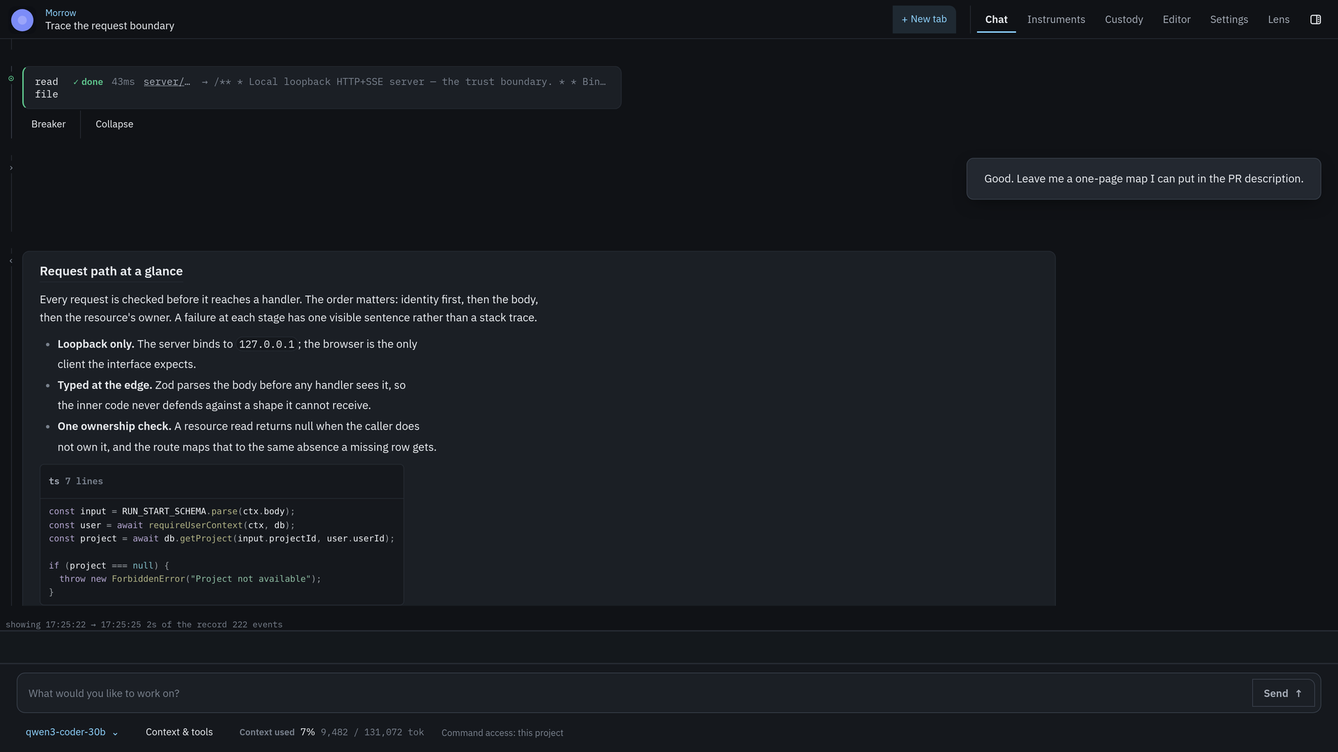
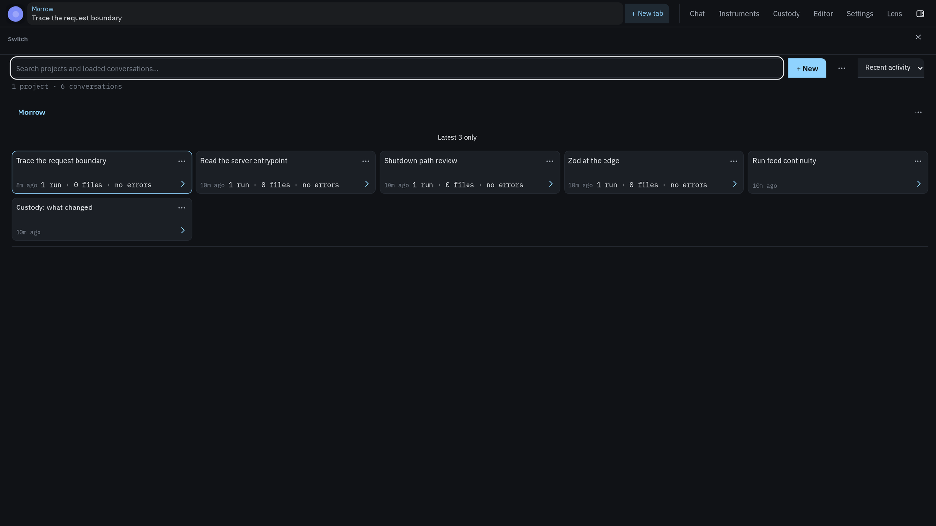
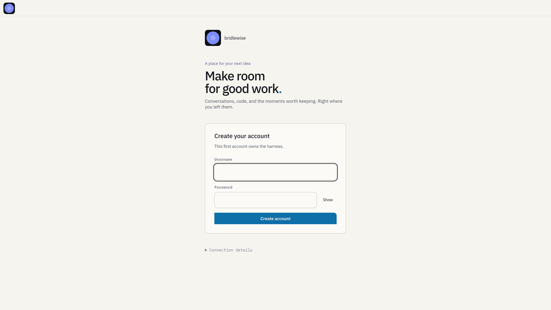
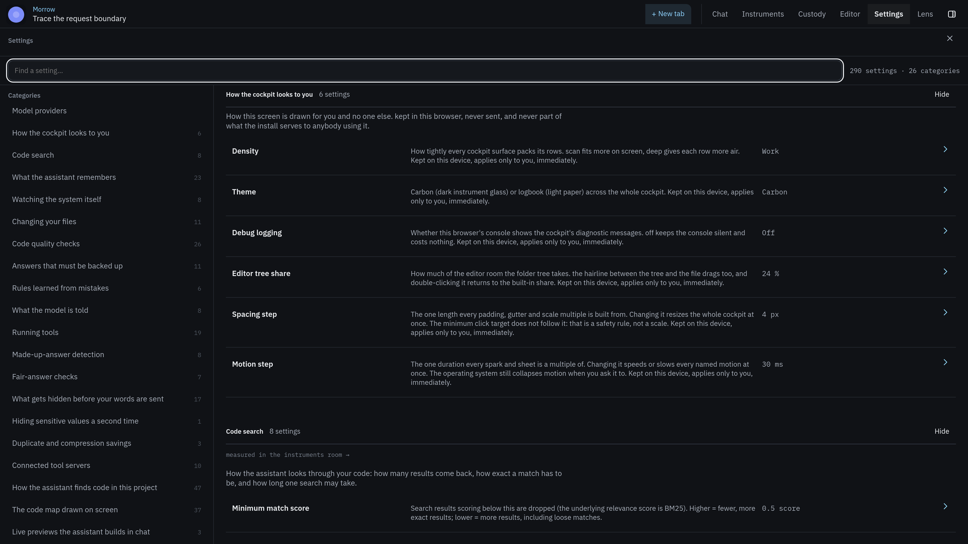
What the design does not claim
- The cockpit is not a general-purpose IDE, a terminal emulator, or a debugger.
- The screenshots are real captures of a pre-1.0 surface. They document the current cockpit, not a finished product.
- The design system is enforced in the cockpit’s token owner and tests; the docs site is a separate implementation and does not prove cockpit behavior.
- A beautiful record is not a safe harness. Read Security and limits.
The design records, audits, and cutover plans live in bridlewise-testing/docs/design/. The token source of truth is src/cockpit/tokens.css in the product tree.